
Blog Effect of Colours on Carpet
The selection of colours for carpets has an important place for our design team.
The selection of colours for carpets has an important place for our design team. We have compiled some details of the colour selection in interior design and the psychology it creates in our text below.
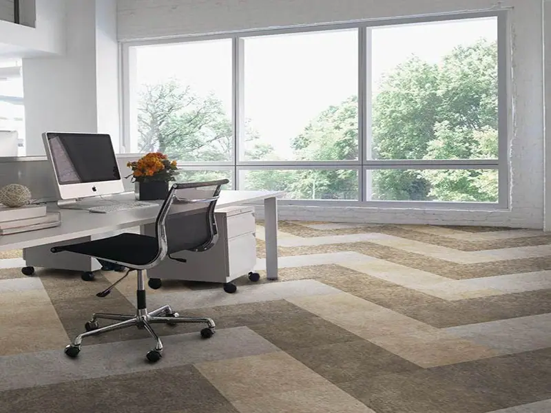
Colour is a powerful design tool that has more impact on the design of a space than any other factor. While designing a hotel, studies are carried out by considering the effect of colour on the consumer of places such as lobby, restaurant, bedrooms and lounge area. The selection of hotel carpet pattern also plays a strong role in this regard.
Beige, cream and grey
These colours will make the appearance of the area much brighter and roomier. White is a natural choice when used in a Mediterranean hotel, while when used in a hospital it reflects cleanliness. In both cases, light and colour integrate with the field, resulting in a simple and bright appearance.
Green, red, yellow and orange colours
If you want to create a warmer atmosphere in your room, you can be inspired by shades of green, red and orange. When choosing a home carpet, consider the furniture; when you go to buy a carpet or want to have a custom made home carpet, compare your carpet colours with the colours of the furniture.
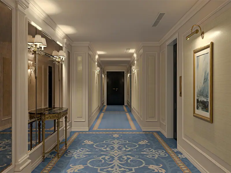
Bright colours
Bright colours on the carpet add vitality to your room. Bright colours will not be appropriate if a calmer environment is wanted to be created. If your area gets traffic too often and the carpet wears out, soft colours should be preferred, these colours will hide the dirt.